


Beginner-Friendly NLP Tools for quick data analysis in Excel, Power BI and ChatGPT

Recently, I’ve been revisiting a few features in Excel and Power BI that use NLP (Natural Language Processing) I hadn’t explored in years. I started my career working with these types of features, and found myself re-engaged after seeing a demo of some of the new features under Preview.
Introduction
There are millions of reasons to use these tools. Here’s a couple:
Anomaly detection: You've been tipped off about some questionable activities and have a pile of files to sift through discreetly. To quickly identify any anomalies without involving your intern, consider utilizing data analysis tools or software designed for pattern recognition. This approach will help you efficiently pinpoint outliers and gain insights into the issues at hand, all while maintaining confidentiality
Transportation Insights: This data comes in all formats. As an operator, you have information that’s key to discovering hidden opportunities and insights that set you apart from the competition. As a transportation official, you have a unique chance to analyze these trends to identify and support underrepresented communities.
It’s easy to get overwhelmed with the data we need to track for our businesses or personal projects, but tools like Excel, Power BI and others make it easier and more efficient to record, track and report our progress.
There are some NLP features that can guide you with some deeper questions into your data. Some of these features have been around for year and some are now enhanced with ChatGPT.
1. The dataset
I’m using the SPD Crime Data:2008 - Present [i], which you can export to a CSV file from the website. One can analyze, visualize and query the data on the Seattle Gov website to compare results. This helps me learn much more about these tools than using provided sample data that will always work perfectly. The dataset I’m using is filtered to only include offenses in 2023.
Please note that when loading this dataset in its raw form into Excel, you can hit the "Analyze Data" limit of 1.5 million cells (hence filtering down the set).
2. Excel ‘Analyze Data’ formerly ‘Ideas’
There’s a feature in Excel called ‘Analyze Data’ it was initially introduced as ‘Ideas’ then renamed later.
If you want to try it, start a new workbook then, Data -> Get Data -> Text/CSV, Open the file, Transform the data, Filter the Offense Start Date for offenses between 1/1/2023 and 12/31/2023, Close & Load.
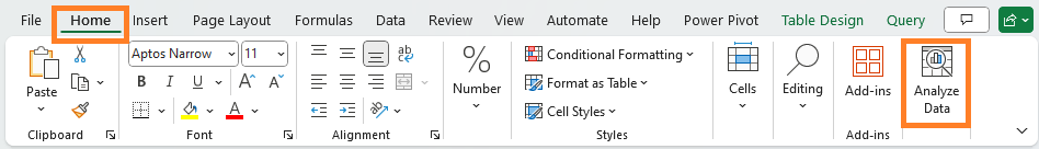
The feature is on the Home tab at the end select ‘Analyze Data’ after selecting a cell from your data table loaded in Excel.
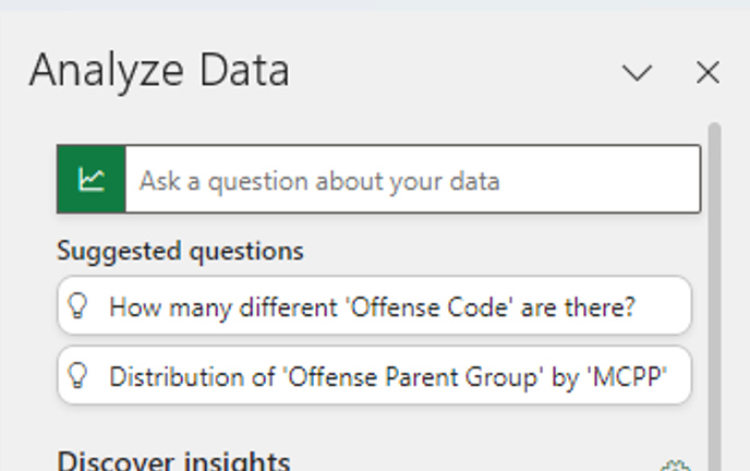
And you should see some suggested questions you can ask on your data and some Pivot Tables and Pivot Charts.
Tips using this feature:
Experiment with it. It doesn’t understand the domain of the data, it’s not going to give us interesting questions related to offenses but it does analyze the distribution of the data between each of the columns and provides suggestions.
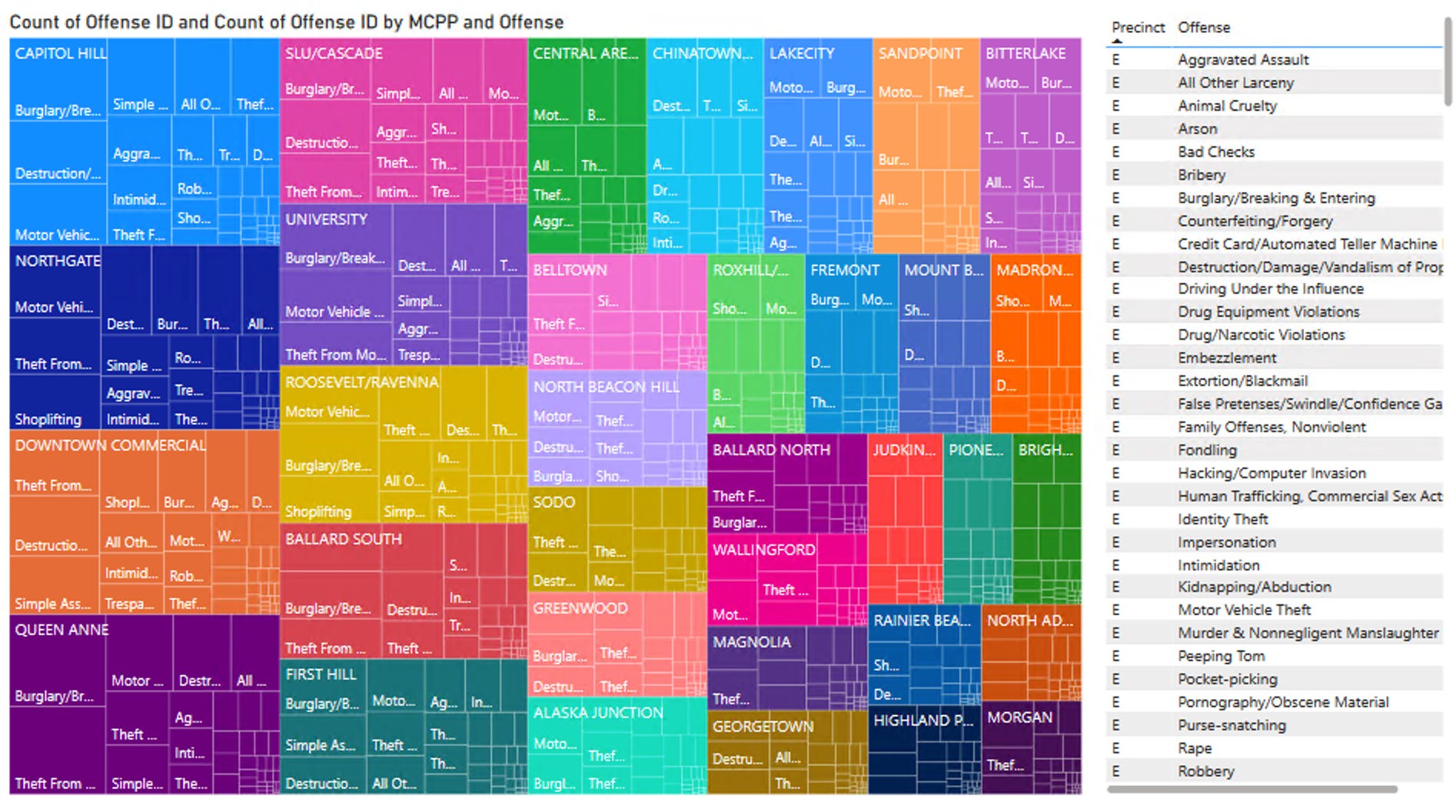
I wanted to see offenses committed over certain areas, MCPP - Micro-Community Policing Plans. I tried
“Top offense by MCPP”
“MCPP and Top 5 Offense”
“Offense by count by MCPP”
And other variations to see if I can get a useful chart .
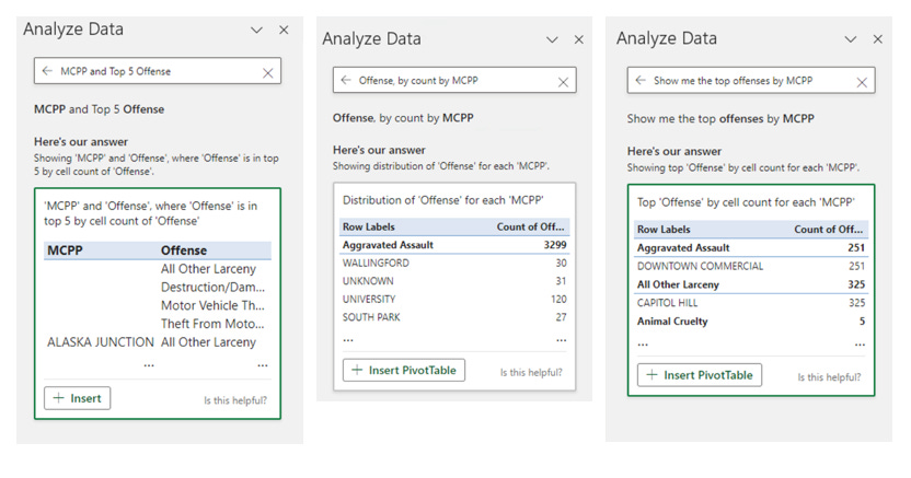
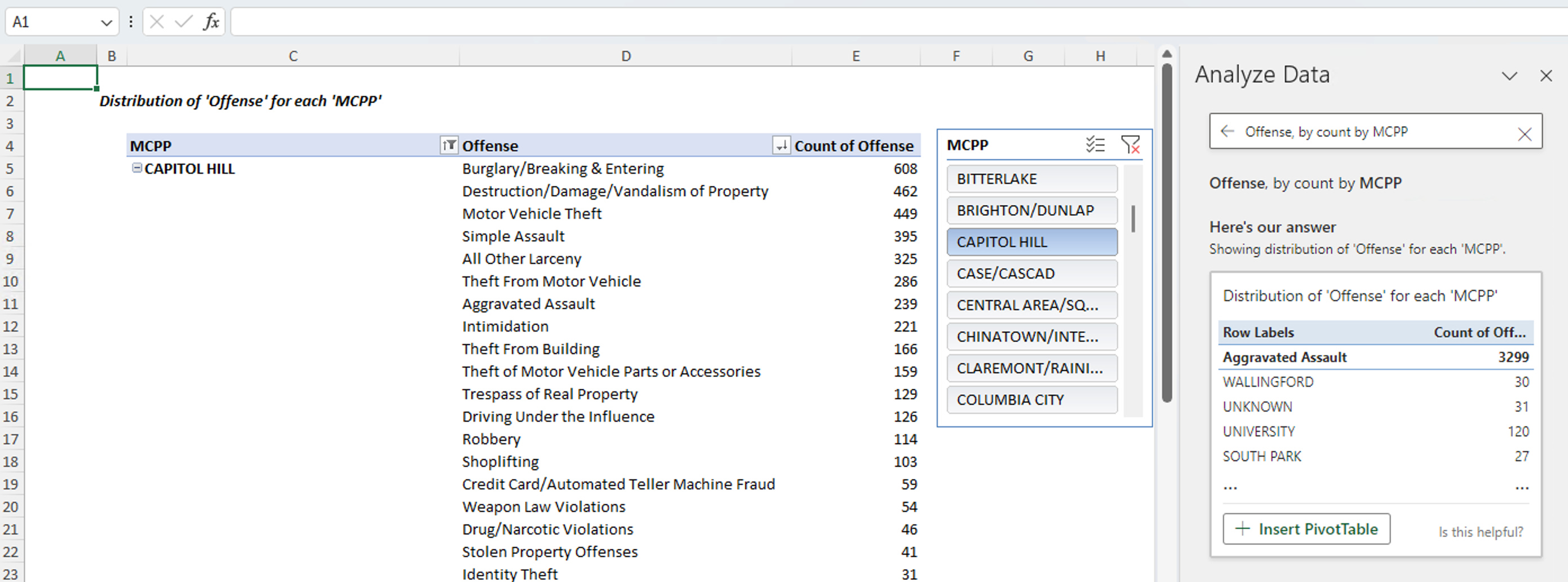
“Offense, by count by MCPP” seemed to get the data I needed for sorting. I half cheated. I built the pivot table first to figure out what was going on then guessed the question, but I think the point here is, once you get that first pivot table, and a visual summary to see the rows, columns and values you have a better understanding and can go and experiment with it.
Comparing the results with the Seattle Gov web site, [Capitol Hill , 608 Burglary offenses in 2023]. This looks correct.
3. Power BI: Adding measures using Copilot (Preview)
Power BI for desktop lets you import, cleanse, and transform data with ease, setting the stage for stunning report generation. This feature is currently in Preview and subject to change. While it's not ready for production environments just yet, it offers a sneak peek at the future possibilities of data management.
This question I was asking earlier, “Show me the most offenses by MCPP”, is actually easier to answer using the reporting features of Power BI. (Create a new report, import the excel file from the last example, in the Build Pane find the HeatMap, in the Data pane select MCPP and Offenses)
Again, Capitol Hill is at the top corner with 608 Burglaries. Looking good.
Don’t like the colors in this heat map check Belinda Allen’s talk on Change Colors in Microsoft Power BI Visuals with Formatting and DAX
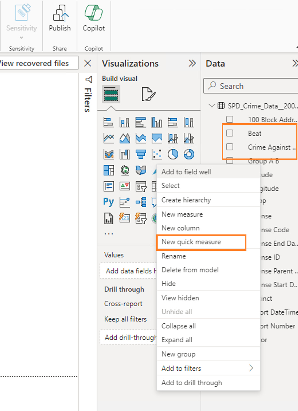
Quick measure feature (in Preview)
A measure is an additional value you want to track on top of your existing data set. This dataset has Offense Start Data and Offense End date, you might create a “Duration” measure to hold the difference. To open this feature, go to the Data Pane, right click on a field and select “New Quick measure.”
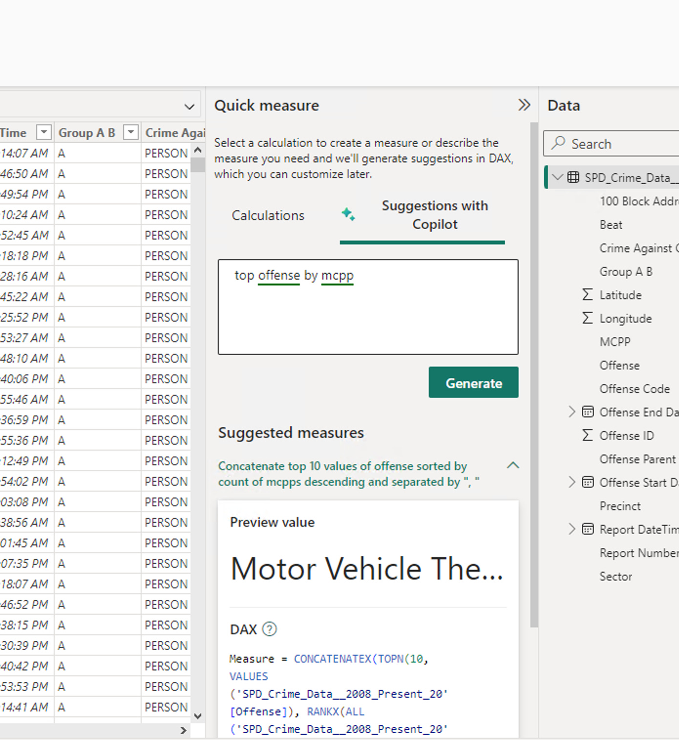
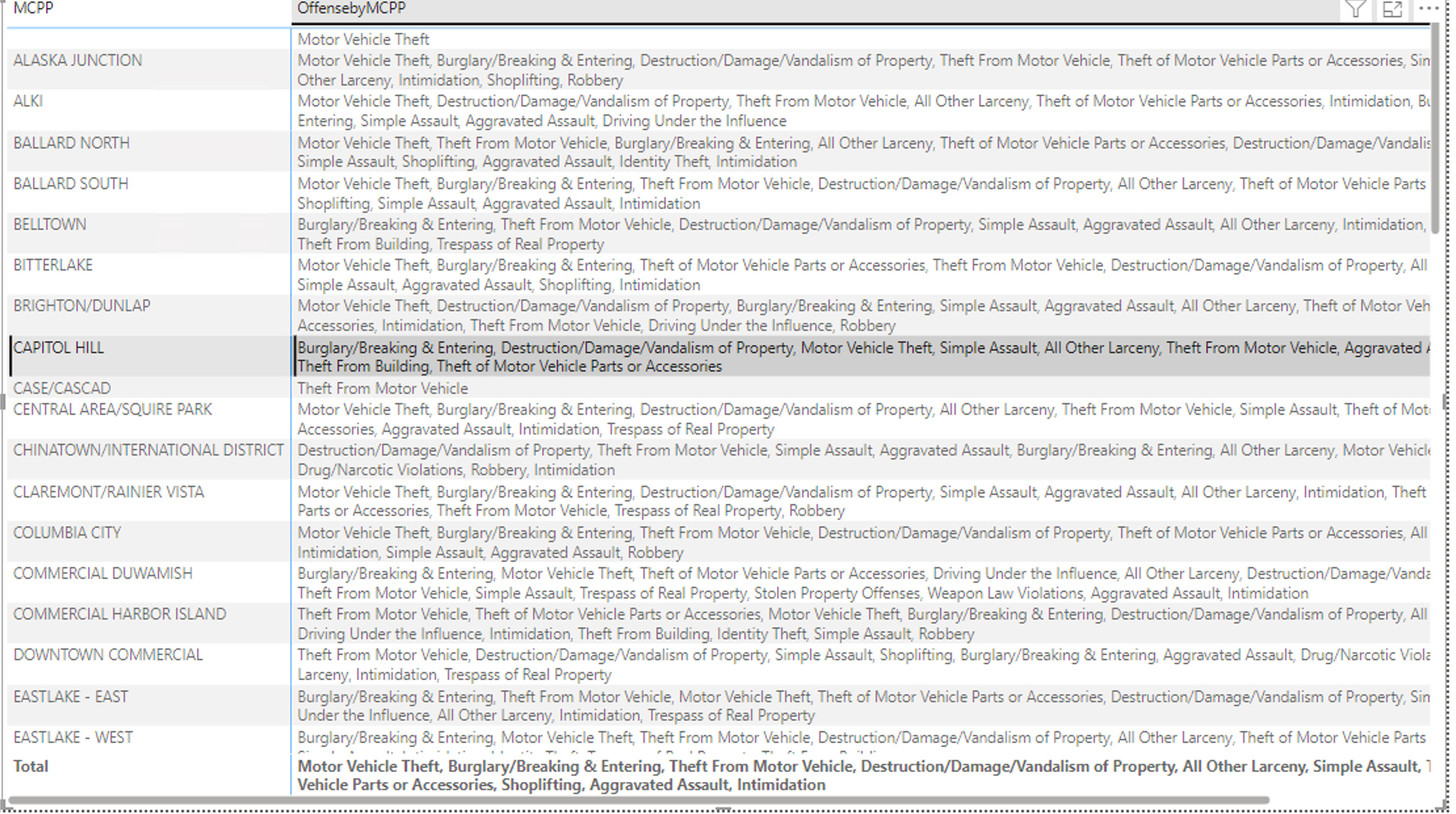
In this example, a measure is created using natural language and recommends adding the measure using the underlying language, DAX (Data Analysis Expressions), to generate the top ten offenses. I can use this recommendation to create a report, selecting MCPP along with this new measure.
4. ChatGPT and Its Data Analyzers
Depending on the size of your data and the files you need to analyze, using Chat GPT provides an interesting way to understand your data and obtain the necessary results. However, you should verify the results. Also, check the privacy and security terms before loading sensitive data into ChatGPT.
Here are a few of the many things ChatGPT can do in this context:
Generate a summary of your data if you ask for it.
Create SQL and DAX queries based on any data or meta-data you provide.
Provide all the Python code it used to generate the reports.
Explore some additional Data Analysis GPTs; look at the top-rated ones.
My Two-Minute Conversation with the Diagrams & Data: Research, Analyze, Visualize Chat GPT after uploading the CSV
"Tell me about the data."
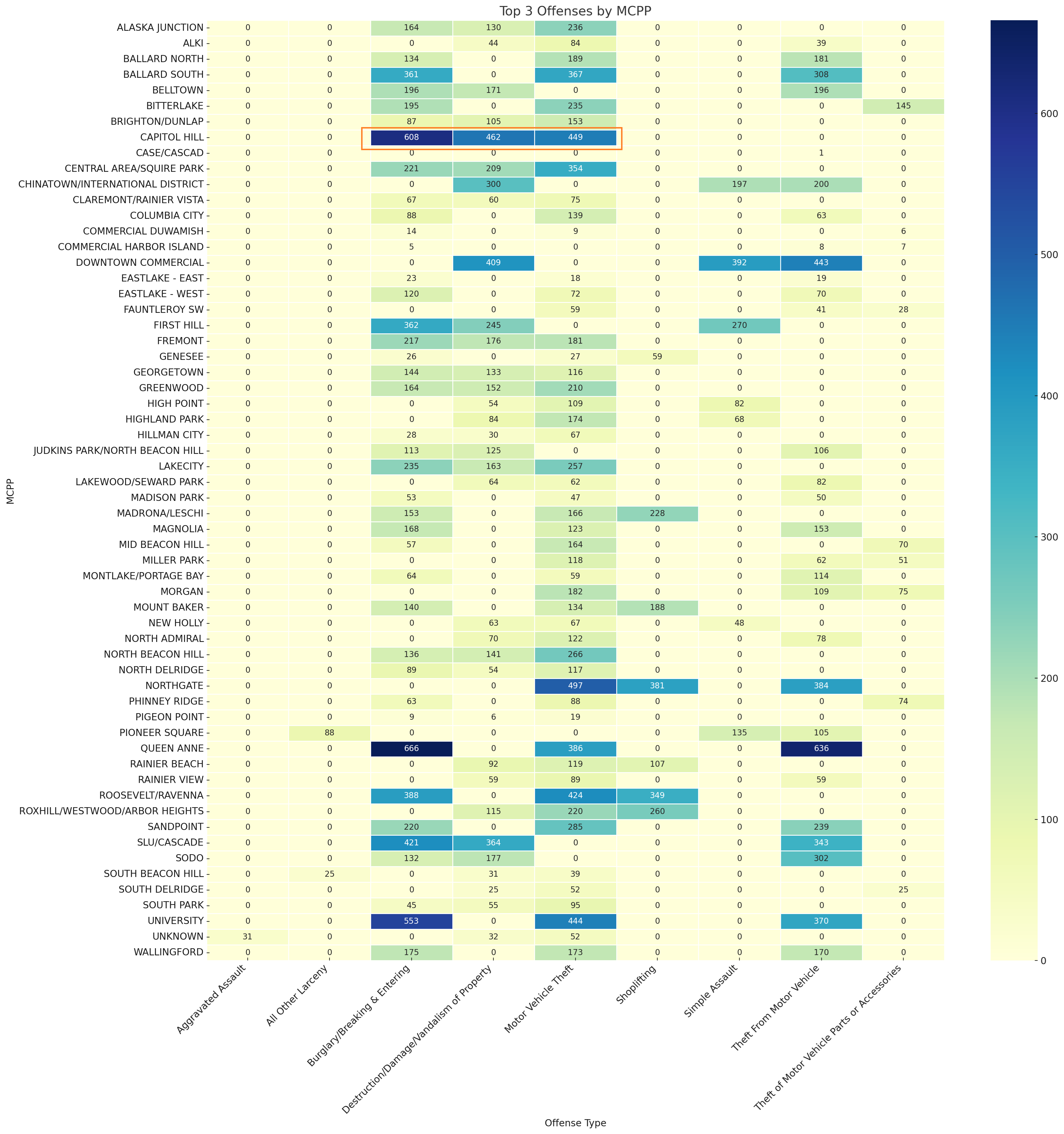
"Can you show me the top 3 offenses by MCPP?"
"Could you show this data for all MCPPs in a heatmap?"
"I can't see Capitol Hill here. Where is Capitol Hill?"
(The map was shrunk down to fit.)
"Adjust the heatmap so I can see all MCPPs."
"How do I save this heatmap?"
And I got this beautiful map with a lot of insights, and the Capitol Hill numbers look correct.
Conclusion
NLP queries can help people get started or at least point them in the right direction for generating detailed reports. The "Analyze Data" feature in Excel can help folks understand how pivot tables are formed. If the result isn’t exactly right, you already have the tools needed to make adjustments. After transforming your data in Excel, you can generate and publish reports in Power BI, where NLP can be used to quickly add measures and fill in any gaps with the details you need for your reports.
OpenAI's ChatGPT, with its specialized Data Analysis capabilities, offers a user-friendly approach to delve into your data and understand how results are derived. It facilitates the drilling down and visualization of your data, but I feel you should always double-check the results.
[i] SPD Crime data to Present : https://data.seattle.gov/Public-Safety/SPD-Crime-Data-2008-Present/tazs-3rd5/about_data
[ii] Analyze Data : https://support.microsoft.com/en-us/office/analyze-data-in-excel-3223aab8-f543-4fda-85ed-76bb0295ffc4#:~:text=Analyze%20Data%20doesn%27t%20currently%20support%20analyzing%20datasets%20over,be%20analyzed%20as%20if%20they%20are%20text%20strings.
[iii] Introducing Natural Language Queries in Ideas : https://techcommunity.microsoft.com/t5/excel-blog/introducing-natural-language-queries-in-ideas/ba-p/1594687