
Dashboard Creation in Power BI with Natural Language Queries

Introduction
I saw dashboards created using natural language queries for the first time a few weeks ago and was impressed. With this feature, your BI (Business Intelligence) engineer or data analyst can set up the base report for you. Then, even those who may not be very familiar with the tools but need dashboards can create them using natural language queries. This greatly reduces the time needed for customization requests. The dashboards can then be easily converted into other reports or PowerPoint presentations.
Let’s see how this works with the Seattle PD (SPD) Crime dataset.
Dataset
I’m using the SPD Crime dataset from my last post. It still presents some interesting challenges when using Microsoft’s Power BI tools. Additionally, SPD has its own crime reporting and Tableau dashboards for comparison, making it a good check to see if I’ve made any errors: SPD Crime Dashboard.
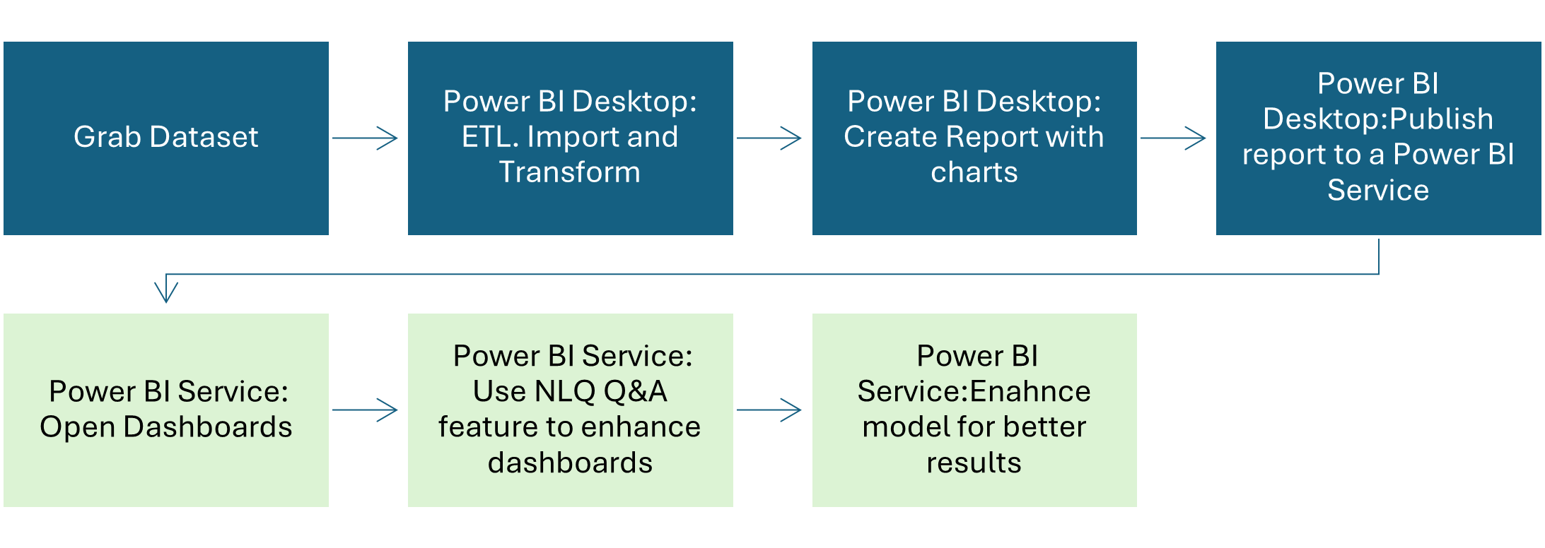
Planning
This was my initial plan, but I would love to be pleasantly surprised by the tools if they let me skip steps to reach my goal. In this post, I’ll be covering the bottom section relating to the Power BI Service.
Report and Dashboard
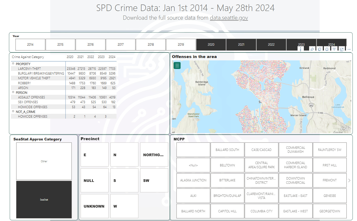
I created the report in Power BI, establishing a base semantic model that I am leaving untouched. Although I encountered a few challenges, I was able to publish the report to the Power BI Service. It looks mostly correct, with most of the crimes located in the Seattle area and a few in Africa (there is intentionally missing geographic data, which I will discuss below).
To get started I pinned the matrix visual to create a new dashboard. You’ll see a prompt on your dashboard that asks you to “Ask a question about your data”
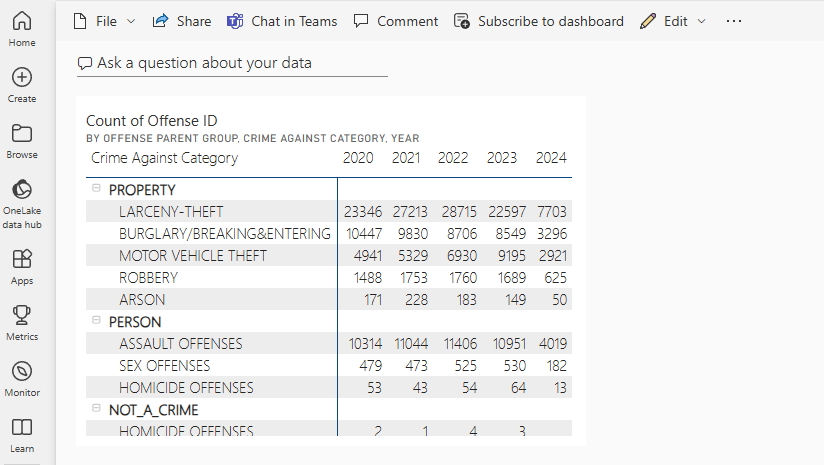
Clicking on “Ask a question about your data” moves you to the Q&A and you get some suggestions based on your current dataset. Remember, there have been no changes to the initial model, so some basic questions can return some unexpected results. I asked,
“Show the offenses by year”
“Show me offense id count by location on a map”
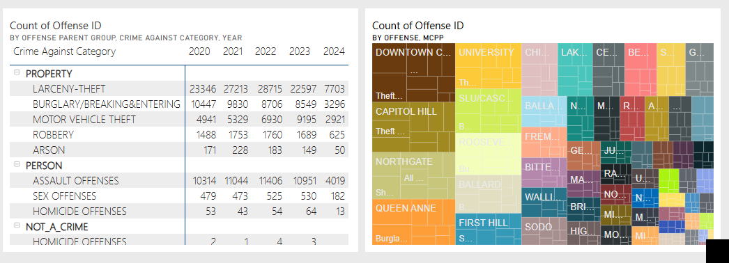
“What are the top 5 offenses by MCPP”
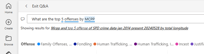
Q&A is including longitude to summarize by. This should not be summarized and will need to be tweaked later. Rephrasing: “Show the top offenses by offense id by MCPP on a tree map” and we’re getting closer.
And, for “Show me the crimes by location on a map”
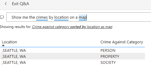
Arghh. Ok, lets move on.
Can we make this better?
There are a bunch of heuristics, tweaks, and synonyms we can add to the base model. It almost feels like they should’ve been automatically picked up. For example, the Latitude and Longitude properties in the model had to be manually categorized as Latitude and Longitude.
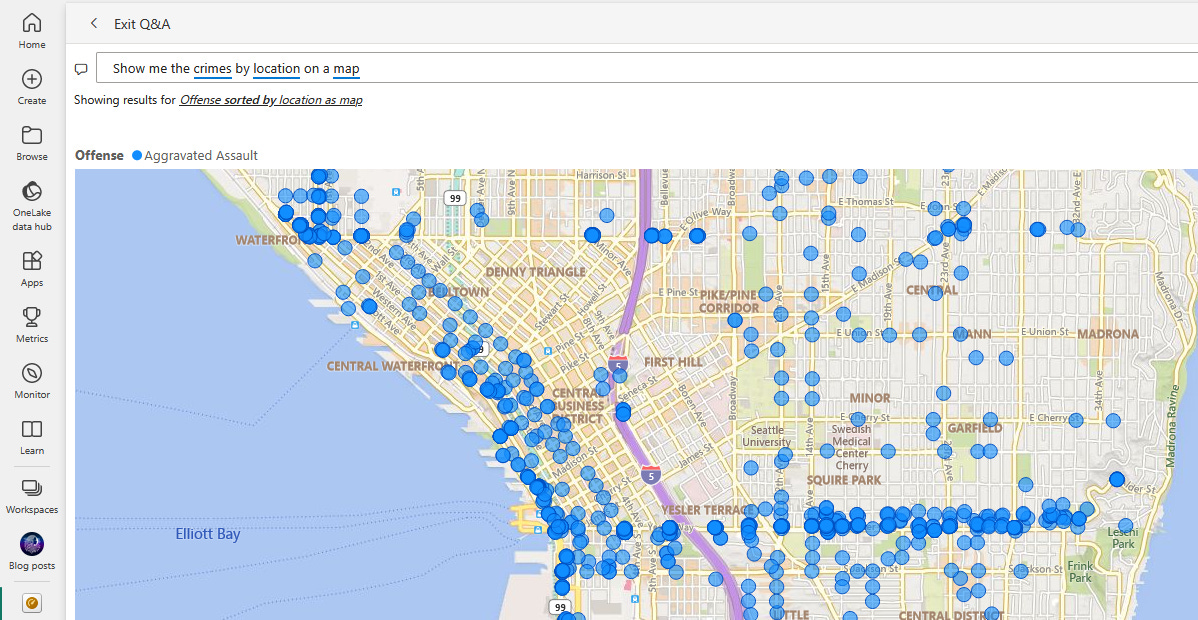
There’s an article here that provides guidance on optimizing the Q&A feature. Following its advice, I made some changes to the model. Now I can re-ask, “Show me the crime by location on a map.”
And go further :
“Show me the crimes for 2024 by longitude and latitude”
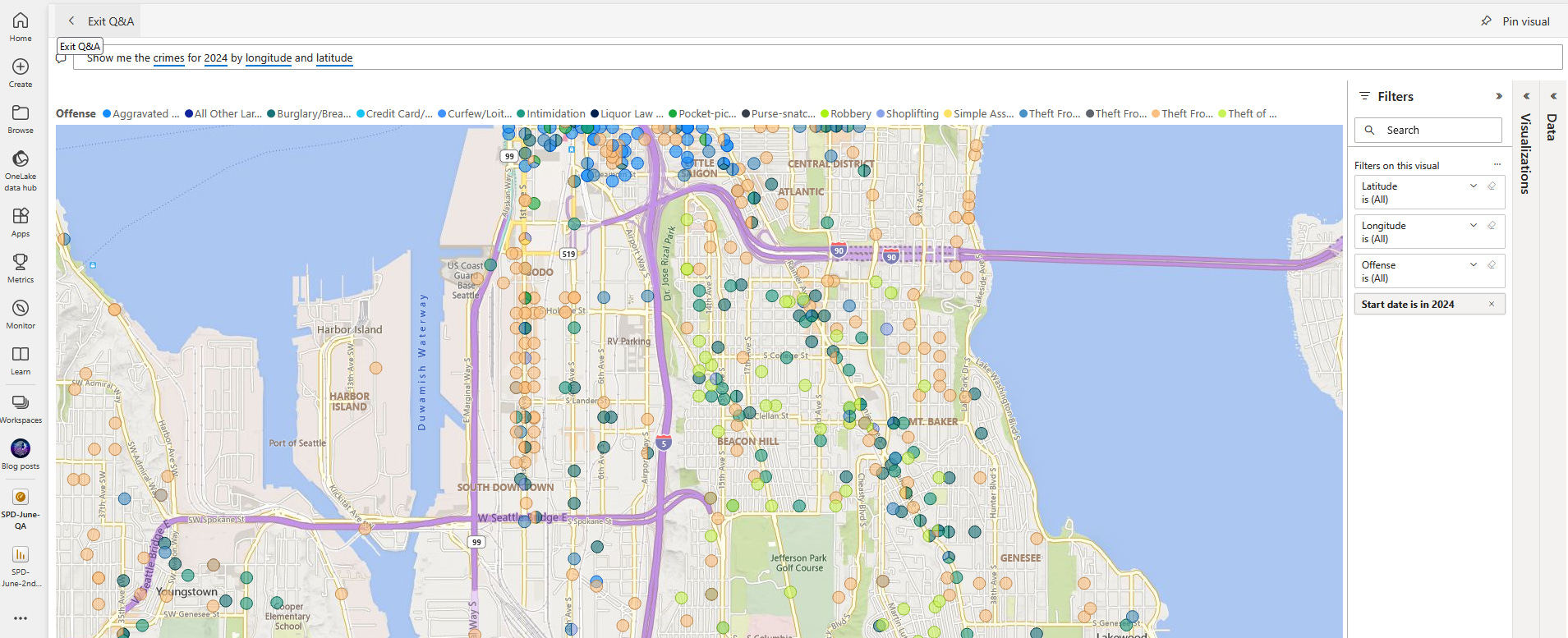
Looking at the orange circles on 1st AVE S, I'm trying to understand why there are so many car thefts around that area and if that data is correct. My initial thought was, "OK, I need to go back into the report and create a visualization to do blah blah blah..." but I don't need to. I can use natural language queries, and Intellisense will correct me and suggest I need "Theft from Motor Vehicle (offense)" and SODO (mcpp).
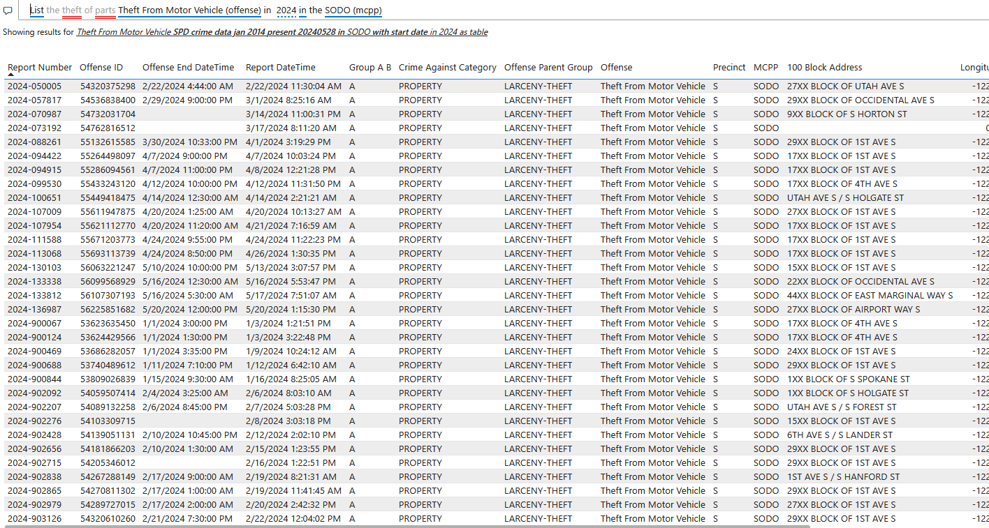
I can pin this on my dashboard too and keep using natural language queries to create more visualizations to my dashboard to see if this type of offense is high in other places.
Challenges
ETL: Homicides Were Missing!
Check everything when you’re using these tools. I have a link above to the SPD dashboard. When I first created the base reports, I noticed that homicides were missing, even though 10 had been reported for the 2024 at the time the data was downloaded. During data transformation, the wrong table got selected with data summarization looking similar.
Location Data is Missing for Homicides
Some longitude and latitude settings will be (0,0) placing them in the Atlantic Ocean off of Africa and you’ll see this on the maps. Location data is collected in a few columns, MCPP, 100 Block Address, and Longitude and Latitude. Even if you merge as much of the data as possible, most map visuals only support either (Location) or (Longitude and Latitude), but not both.
Power BI Maps
Maps are off by default. There’s a legal agreement you’re forced to read about your data being shared with SK Telecom (South Korea) and some other third party, but it also feels like this feature is in preview and may not be fully supported in dashboards. The point you zoom into for critical information does not persist, so as soon as you move out of Q&A, the map resets. This also seems to happen in Power BI Reports for any filters or changes made.
The ArcGIS map is easier to use and more customizable. However, you need to be careful not to give the maps too many data points, intentionally or not, as this can slow down reports and dashboards.
Conclusion
Pros
Follow-up questions using natural language from your dashboard visuals: If you see a visual pattern, you can now ask about it instead of going back to manually create a report and another visual appears with additional info. To me, this is the most valuable feature.
Integration with other tools Like Excel, PowerPoint, and report sharing and publishing.
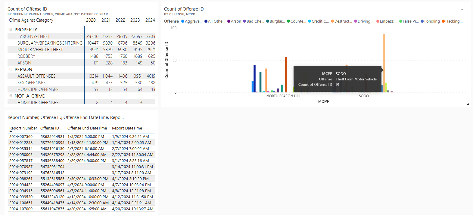
Intellisense and help with what you can and cannot ask on your data: This is essential and one of my pet peeves when I was initially working on these types of tools. To me, there’s nothing natural about asking, “Show me the crime for 2024 order by count of offense id by mcpp for SODO, NORTH BEACON HILL (mcpp) on a clustered column chart” but I got some help from Intellisense, and I got the different colors across the chart I needed.
Cons
Ramp-up time: Learning the tools and tailoring the model in a way that the feature works best takes time but it’s a great investment.
Specificity in queries: You still need to be specific about what you’re asking, especially around grouping and the queries start to get long.
Persistence of visual changes: After asking questions and customizing the visuals generated from those questions, the visuals don’t persist those changes back on the dashboard after pinning.
In my last post, I was using ChatGPT-4 to upload the SPD crime data CSV and start generating visuals after a couple of minutes with no semantic modeling of the data. I understood that data accuracy needed to be confirmed, but I could do a quick comparison with what was officially published and have a heatmap of hot spots by MCPP in a few minutes.
I see the value in having tools that ensure accuracy and rule out any ambiguity in what is being presented. However, it feels like there’s still a way to go before we can ask arbitrary questions on Q&A.
One last thing, do not leave any valuables in your car if you’re parking near 1st Ave S!