


Revisiting Maps
or where did I go wrong with Power BI Map Visualizations.

Designing reports with maps visualizations using Power BI for my last post irked me to no end. Auto Zoom being on by default, combined with bad data, is not a good combo. So, I decided to dive into mapping visualizations to gain a better understanding. In this post. I’m covering mapping from Google Looker Studio, Power BI, Tableau and Apache Superset.
Dataset
I’m still using the SPD Crime dataset. SPD has its own crime reporting using ArcGIS and Tableau dashboards for comparison, making it easy to verify against. For example, Alaska Junction, Seattle, WA is not in Alaska.
The dataset is realistic, ever growing and not clean, making it great for evaluating these tools.
Typical Map Visualization Features
So we have :
Zoom & Pan: These features shouldn’t be abused (yes, Power BI, I'm talking to you).
Customization of Tooltips: When you hover over a point of interest.
Visual Customization: Colors, map type (satellite view, etc.), bubble maps, heat maps, 3D views, etc.
But the ones I think worth mentioning more are:-
Cross filtering and Integration
When you have additional charts of filters on your dashboard that can be interacted with and to update your map selection and vice versa. You select your point of interest on the map, and your corresponding charts and reports on the same dashboard reflect your changes.
This is probably the most important one to configure first. These maps work better with a smaller set of data points, so filtering the data using the existing charts provide more flexibility than try to filter it all beforehand.
Viewports and Locking
A viewport is a closed region of the map for viewing. Having a feature to lock on a specific area of the map as your users interact with it keeps them focused on the details. Some maps have a lock feature, ensuring that no one can fiddle with any settings at the last minute, just before a presentation.
So many layers …
Base Map Layers: These include options like no streets, satellite views, night and day views, and different color schemes.
Custom Layers: ArcGIS maps make it easier to use custom layers. You can search for additional layers, such as the Seattle Micro Community Policing Plan Boundaries, save them to your account, and load them up.
Demographics and Informatics: These are also provided by ArcGIS and other map visualization tools.
Using mapping visuals in reporting tools
Google Looker Studio
Google has two products with similar names: Looker and Looker Studio. I’ve used the free one, Looker Studio, in the past for map visualizations in reports. It’s straightforward and easy to use.
CSV Files are Supported
Latitude and Longitude: If these are already in the CSV, Google handles the outliers where the data is missing and does not map out crimes in the middle of the ocean.
Calculated Fields: Create a calculated field to hold the Latitude and Longitude pair in Looker Studio.
Map Integration: Click on the map, add the field, and include offense counts.

Google Looker Studio - Heat Map

It’s fast and reliable, and there’s a button on the top right to “Pause Updates” so you can adjust your other charts and tables without the map resetting its viewport. The rendering is smooth, and you can customize the number of bubbles visible, ranging from 10K to 10 million.

Because of the great map rendering performance, you can scroll through the different styles and adjust as needed. You can also add calculated fields with a few clicks to enhance the accuracy and readability of the data presented.
There’s no longitude or latitude information stored for this type of offense, but Looker Studio makes it easy to combine the other field of information to still visualize the where abouts.
To sanity check the reported info, I added a filter on “Offense Parent Group” and Googled the information in the tooltips as I hovered over the areas.
Power BI
Map Visualization
Have a large dataset? Before you do anything with Power BI's map visualization, you might want to switch off Auto Zoom.
Auto Zoom should be off when you don’t have confidence in your locations.
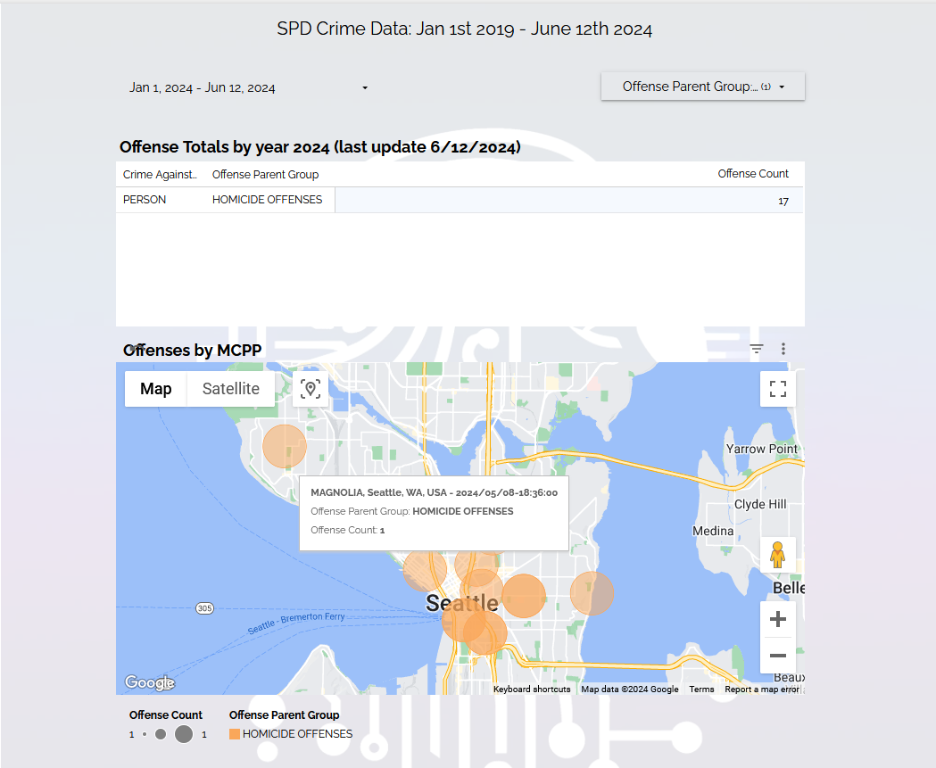
I’ve filtered the data to 2024, Homicide. Okay, we get 17, same as on Google Looker Studio.
There's no block address or latitude and longitude recorded for homicides, so MCPP in “Seattle, WA” needs to be added as a calculated field and configured as a Location, similar to Google Looker Studio.
Why can’t you just filter out invalid longitude & latitude?
Ideally, you don’t want to do that. There are about 25K offenses that don’t have longitude & latitude but do have MCPP info, and for data like this, you don’t want to leave stuff out.

Ok so far so good.
Now with all the offenses.

And we’re zoomed out to Alaska because of Alaska Junction, even though the data point has the city and state (Seattle, WA) hard-coded to it. Turning off Auto Zoom fixes this issue for the time being, and also filtering out Alaska Junction from MCPP.
The navigation controls are not as smooth, but it's okay. Also, I don’t recall summarizing the information on Looker Studio. Here, we’re getting all the details.

Power BI Filled Maps
For this dataset, its not ideal because it’s only supporting choropleth maps by state, and ideally it would be good to see this by MCPP but you can read more about them here.
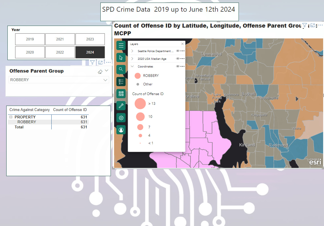
ArcGIS Maps for Power BI
You can sign up for a free subscription with ESRI. Here is the initial load with MCPP data.

Available Base Layers

ArcGIS Seattle Police Department MCPP map
ArcGIS comes with a large set of layers, and one of them is the Seattle PD’s MCPP map layer.
You can customize the layer on the ArcGIS website under your account and pull it into Power BI using the ArcGIS map visualization, enabling cross filters by MCPP.

ArcGis editor

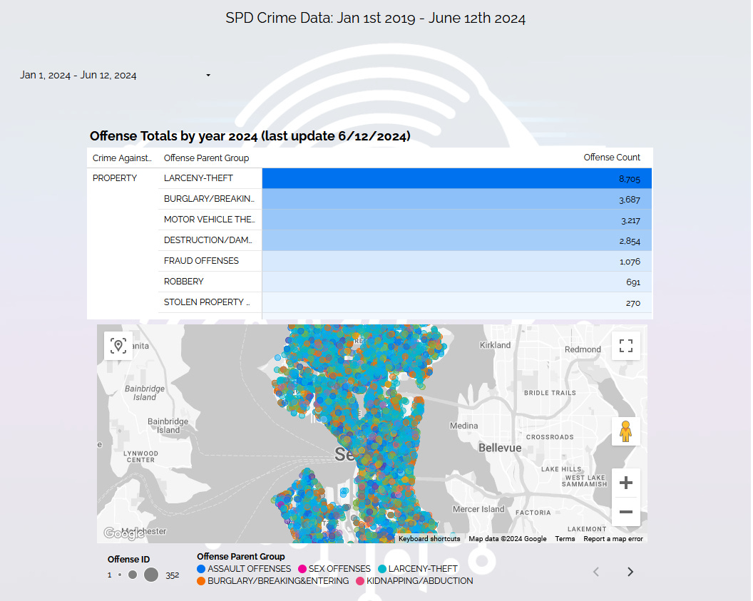
Tableau
Tableau Public is free for connecting to basic set of data sources, like Excel , CSV, JSON etc. Tableau can connect to ArcGIS but I believe you need an upgrade version of Tableau Desktop. For now I’ll take a look at the mapping feature in Tableau Public.

I feel like Tableau is taking the opposite approach of Google by not rendering anything until you have cleaned and filtered all your data points, which you can do in the tool. There are hints at the bottom of the visualization pane. I feel this makes it less flexible than Looker Studio and Power BI, but on the upside, the report owner knows where missing data is.

One issue I had with the ArcGIS maps in Power BI was that once you added additional data layers, there was no legend to inform you of the ranges. In Tableau, there is a layer of renter-occupied units, and as expected, where it is less densely populated (red areas in Seattle), crime reports are lower, and higher in the green areas. Additionally, for those with color blindness, you can change the palette colors for the data layers.
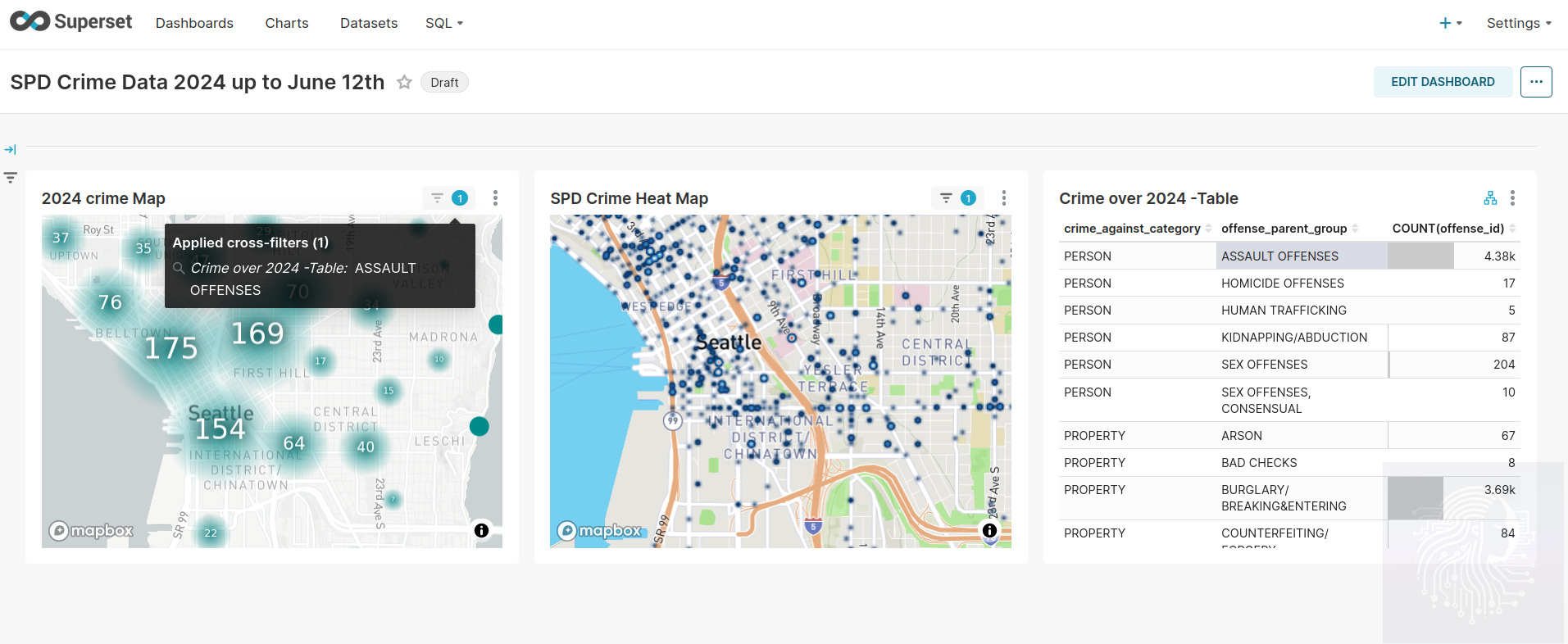
Apache Superset
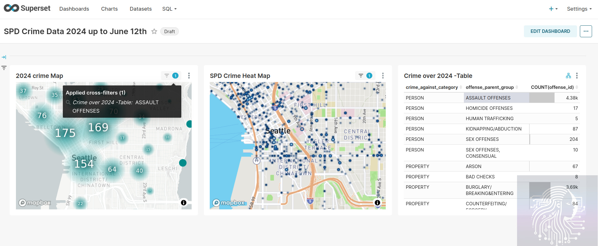
Apache Superset is free under the Apache License. This dashboard creation tool runs great on Linux; Ubuntu is my preferred development environment. I first encountered this tool a few years back to store my own semantic models for testing. It’s a simple analysis tool without too many bells and whistles but does what it should. It supports a number of database connections to data. The SPD crime data here was copied into Postgres, then Superset allowed me to explore, generate queries, and create datasets for chart and dashboard creation.
It feels blazing fast on the same hardware. The last three visualization tools I discussed ran on Windows 11. It probably feels this way as Windows 11 is a beast of an OS. You feel it the most when cross-filtering between multiple maps in the dashboard, which can be really useful for analyzing patterns.
MapBox
MapBox has a free usage tier.
Superset is integrated with MapBox, but you’ll need to get an API key and update the Superset config file to use it. It’s not the most user-friendly tool, but if you’re familiar with managing databases and config settings, it works well.
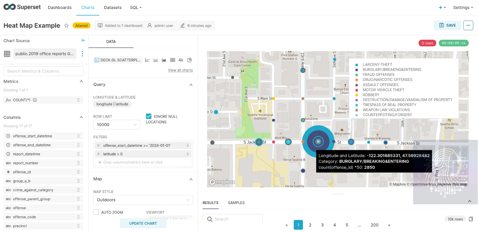
This scatterplot need some additional customizing to get the size of the points to show so multiplying the counts of offense by 50.
Conclusion
After using Google Looker Studio to get up and running quickly and schedule reports, I'd probably start with this and then delve deeper into their paid map offerings.
ArcGIS Maps offer a lot of available layering information and are supported in both Power BI and Tableau.
If I need speed and performance to render a whole dashboard of maps with cross-filtering, I’m picking Superset.
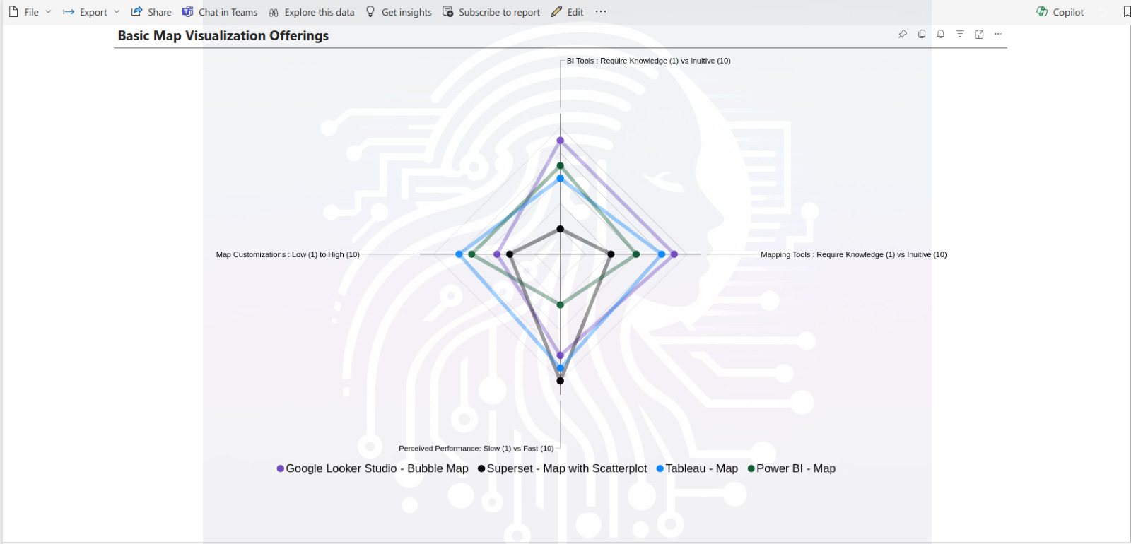
Below is an attempt to visualize my feelings on the basic map offerings.
I would love to hear about any great mapping tools I missed or feedback on this article.